We were told to research Richard Morrison and find one of his title sequences to analyse. I decided to create a Prezi because it makes may work more interactive and pretty instead of a simple PowerPoint Presentation. This is my research and analysis:
Wednesday, 22 January 2014
Richard Morrison Research
We were told to research Richard Morrison and find one of his title sequences to analyse. I decided to create a Prezi because it makes may work more interactive and pretty instead of a simple PowerPoint Presentation. This is my research and analysis:

Sunday, 19 January 2014
Saul Bass Research
In Wednesday's lesson we looked at a graphic designer Saul Bass and a bit about him and his work as a title sequence designer as well.
He is an American graphic designer, born in May 1920 and died in April 1996. He went to a art collage. He is most famous for his logo designs in posters as well as his title sequence work. Bass' title sequences are unique because of his hand drawn images and geometric shapes and their symbolic meanings. He became recognisable after his title sequence called 'The Man with the Golden Arm'. Bass worked with Alfred Hitchcock. Here are some of the title sequences Bass worked with Hitchcock:
- North By Northwest (1959)
- Vertigo (1958)
- Psycho (1960)
I decided to do it as a PowerPoint so it is easier to see the images and information.
Analysis Napoleon Dynamite
At the beginning of the title sequence
there is no music, just a plate of nuggets and a squirt of ketchup. This choice
of food suggests a cheap and easy kind of food. Also we see the production
company which is Fox Searchlight Pictures. The plate display is on a red
carpet.

We hear faintly birds chirping suggesting that the film is in the suburbs. The next two images is of different styles of plates with different food on different backgrounds. One says Paramount Pictures and the other says in association with MTV Films.
We hear faintly birds chirping suggesting that the film is in the suburbs. The next two images is of different styles of plates with different food on different backgrounds. One says Paramount Pictures and the other says in association with MTV Films.

The music starts to play showing us a U.F.O card suggesting that Napoleon is into extraterrestrial things. It also tells us who is staring in the film.
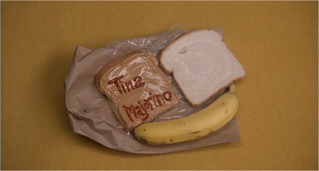 We then see that it goes back to food on a plate
while telling us who else is in the film. We see a tray with food and a lunch
paper brown bag suggesting that this film could be based in a school. This is similar
to the way Americans carry their lunch to school.
We then see that it goes back to food on a plate
while telling us who else is in the film. We see a tray with food and a lunch
paper brown bag suggesting that this film could be based in a school. This is similar
to the way Americans carry their lunch to school.  Here the title sequence gets
creative when the person is holding a paper star and then the camera focuses on
the star (dept of field). We find out that he has a library book ‘Bigfoot and
me’. He likes reading. We see that he is interested in science and the universe. The image changes to a type of sweet which tells us that he could
be quite nerdy as they are stereotyped to always have mints. Another dept of
field is used when the name in the chap stick is revealed. This is confirming
that Napoleon may be a nerd.
Here the title sequence gets
creative when the person is holding a paper star and then the camera focuses on
the star (dept of field). We find out that he has a library book ‘Bigfoot and
me’. He likes reading. We see that he is interested in science and the universe. The image changes to a type of sweet which tells us that he could
be quite nerdy as they are stereotyped to always have mints. Another dept of
field is used when the name in the chap stick is revealed. This is confirming
that Napoleon may be a nerd. Then we see that he is quite artistic as we see he drew a buff man with weapons. We see that he is interested in mystical creatures by his drawing. He comes across as childish because we see that he still plays with toy cars. We become positive that he is a smart kid as he likes maths.
This title
sequence shows a pair of hands putting and removing different objects on a
table. This title sequence is a low budget one as not much is shows
other than a few things that Napoleon likes and is interested in.
This title
sequence is clearly of the comedy genre. The title sequence is light hearted by
the mood of the music and the presentation of the titles. Most of them are
written out of sauce or written by pen suggesting that the film is not serious.
We do not see the
face of any characters but we already have a feel of what type of person
Napoleon is and isn’t. We see that to make a good title sequence, you do not
have to have an actual character or key scenes in the title sequence for it to
be an effective title sequence. We only see a hand creating excitement and
suspense of what the film will be about.
Sound: At the start of the sequence there is silence but then we slowly start to hear some birds tweeting suggesting that the movie is set in a suburban area where there is a lot of fresh air and everything is clean and proper. In other words posh. There is music throughout the title sequence as we see what different types of things Napoleon likes to do. The beat of the music is quite awkward suggesting that Napoleon is an awkward character.
Cinematography: The cinematography is very limited in this title sequence as it is a stand still title sequence meaning that the camera does not move to give us different angles. They would have needed to get the camera still and in the right place.
Mise-en-sence: Mise-en-scene as used to create a persona of Napoleon. Different types of food that Napoleon likes were shown. His library books. Cards for clubs he is a part of. Chap sticks and sweets that you suck on was shown. Maths equipment and his drawing all give the audience a feel of what type of boy he is.
Editing: A type of edit used in this title sequence was dept of field which made the star in focus and the background not in focus. As this title sequence is not a moving one the only edit it did was cutting to different items.
Thursday, 16 January 2014
Conventions of title sequence
Conventions: ingredients of a title sequence
Transition: one place to another
- A title sequence is the method by whom a films credit production and cast members utilising visuals and sound.
- The opening credits of motion pictures list the most important members of the production and they are either superimposed on a blank screen over the action.
- There may or may not be accompanying music. the aim of an opening sequence may be to establish character, setting, genre, mood or atmosphere.
- The sequence is supposed to foreshadow the film and create suspense and interest.
Media text, film titles have conventions. visual and audio clue tell you that what you are watching is a title sequence.
Technical convention = The technical side of conventions e.g. putting it all together
Symbolic convention = What it is supposed to mean
Genre convention = What kind of film it is based on and what is being shown
Common credits in a film opening:
- Name of production company
- Producer
- Name of title
- Director
-Executive producer
- Top billing actors (stars)
- Name of studio
-Music composed by
- Other key crew staring
We looked at several title sequences in class. They were:
-Hulk
-The Avengers
-Se7en
-Juno
-Napoleon Dynamite
In the lesson, we did a time line together on a film title sequence noting down on the bored all the text that was shown as the title sequence was going on. We were then told to go on the website 'artofthetitle' and find a random title sequence to make a time line for that. Here is my one: i picked 21 Jump Street

When i finished doing my own timeline, i payed more attention to titles in the films that i watched. Getting all of the titles in a 2 minute title sequence must have taken a lot of time. I can apply the titles of any title sequence into my coursework as the names are a very important part of a title sequence.We looked at several title sequences in class. They were:
-Hulk
-The Avengers
-Se7en
-Juno
-Napoleon Dynamite
In the lesson, we did a time line together on a film title sequence noting down on the bored all the text that was shown as the title sequence was going on. We were then told to go on the website 'artofthetitle' and find a random title sequence to make a time line for that. Here is my one: i picked 21 Jump Street

Wednesday, 15 January 2014
First Pitch
Leanne: Monday's Lesson
In Monday's lesson we had to present our pitch. We did a PowerPoint presentation to present our idea to the class and to our teacher. We discussed the summery of the film (what the film is about), included the Production Company, the Box Office of our supporting films, the Distributor, we added some kidnapping research to the PowerPoint as well as possible actors we want in our film, lastly we reveal what the film is really about (in more depth).
When we finished presenting our pitch, the budget was pointed out to us that it is too low for the high stars we want to act in our film meaning that our budget needs to be higher. We wanted to have Film4 as our production company but as they only do small budget films we decided to stick to Lionsgate.
Before our lesson, we ( Lucy, Megan, Christian and myself) decided that we were going to film ourselves presenting our pitch so that we can see what our teacher and classmates saw.
In Monday's lesson we had to present our pitch. We did a PowerPoint presentation to present our idea to the class and to our teacher. We discussed the summery of the film (what the film is about), included the Production Company, the Box Office of our supporting films, the Distributor, we added some kidnapping research to the PowerPoint as well as possible actors we want in our film, lastly we reveal what the film is really about (in more depth).
When we finished presenting our pitch, the budget was pointed out to us that it is too low for the high stars we want to act in our film meaning that our budget needs to be higher. We wanted to have Film4 as our production company but as they only do small budget films we decided to stick to Lionsgate.
Before our lesson, we ( Lucy, Megan, Christian and myself) decided that we were going to film ourselves presenting our pitch so that we can see what our teacher and classmates saw.
The Art Of Film Title
http://www.smashingmagazine.com/2010/10/04/the-art-of-the-film-title-throughout-cinema-history/
I have been asked to read this article and pick out five points which are of interest to me:
1. In the section: Titles In Silent Film what interested me the most was that animations affects within film
titles was around 1906. ''One of the earliest known title animations is seen in the work of
J. Stuart Blackton." It looks like an old fashioned film. It interested me because of the use of colors. In modern day text you wouldn't normally see a grey background but even though this was made in 1906 is feels like the idea was against the normal text background.

2. In the section: The Silence Is Broken, what captivated me was that even if you were to produce a film title
with no imagination (see below), it could make the audience wonder what the film is about and start to think
about the colors that are used and what associates with the colors. This title is more of a simple title. It is good because it gets straight tp the point that the film will be about a girl and her name is Annie Hall. However it makes you think why is it that plain and that some color should be added to it.

3. In the section: The (True) Birth Of The Title Sequence, what stood out to me was the film title does
not have to have a blank background. I could have anything on it using different techniques.
For example, ''A great draftsman and visual storyteller, Saul Bass ran the gamut of techniques for his
title sequences: montage, live action, cut-out paper animation, typography in motion." This title had
text and an image on it. This is interesting because a title is normally supposed to just be a title but
this title has an image on it which shows creativity.

4. In the section: The Digital Era, And Modern Trends In Film Title Design, what caught my eye
was how accidents can produce something that was better then or creates an idea. For example,
''While Cooper was working on the sequence for “Darkness Falls” (2003), some glass he was using suddenly split, and the crack cut across the eyes of a girl in an old picture. The incident added
suspense to the effect."

5: In the section: Typography Resources, what i found interesting was that most type faces were available to be downloaded at a price which is surprising because you wouldn't associate a
films type face to be available to the whole world to have. Also it was interesting how Waltograph
(Walt Disney) type face has its own alphabet.

I have picked out my five points and for evidence. I have commented, copied and pasted the
pictures and quotes that i found interesting.
titles was around 1906. ''One of the earliest known title animations is seen in the work of
J. Stuart Blackton." It looks like an old fashioned film. It interested me because of the use of colors. In modern day text you wouldn't normally see a grey background but even though this was made in 1906 is feels like the idea was against the normal text background.
2. In the section: The Silence Is Broken, what captivated me was that even if you were to produce a film title
with no imagination (see below), it could make the audience wonder what the film is about and start to think
about the colors that are used and what associates with the colors. This title is more of a simple title. It is good because it gets straight tp the point that the film will be about a girl and her name is Annie Hall. However it makes you think why is it that plain and that some color should be added to it.
3. In the section: The (True) Birth Of The Title Sequence, what stood out to me was the film title does
not have to have a blank background. I could have anything on it using different techniques.
For example, ''A great draftsman and visual storyteller, Saul Bass ran the gamut of techniques for his
title sequences: montage, live action, cut-out paper animation, typography in motion." This title had
text and an image on it. This is interesting because a title is normally supposed to just be a title but
this title has an image on it which shows creativity.
4. In the section: The Digital Era, And Modern Trends In Film Title Design, what caught my eye
was how accidents can produce something that was better then or creates an idea. For example,
''While Cooper was working on the sequence for “Darkness Falls” (2003), some glass he was using suddenly split, and the crack cut across the eyes of a girl in an old picture. The incident added
suspense to the effect."
5: In the section: Typography Resources, what i found interesting was that most type faces were available to be downloaded at a price which is surprising because you wouldn't associate a
films type face to be available to the whole world to have. Also it was interesting how Waltograph
(Walt Disney) type face has its own alphabet.
I have picked out my five points and for evidence. I have commented, copied and pasted the
pictures and quotes that i found interesting.
Monday, 13 January 2014
Start of Coursework
What we have done this week is, we have been told that we are starting to begin our title sequence coursework. We were put into groups of four, (Megan Harris, Lucy Abbott, Christian O'Brien) which will be the people that i am going to produce my title sequence with. The first thing we did as a group was, think of a genre to base our title sequence on. We had trouble deciding on what genre to do, so we thought of made up stories each and we decided on one to do. This again was quite had as we all had different ideas that we wanted to do.
We decided that our film includes a kidnap which is mainly inspired by A Beautiful Mind. Our film is about a girl who starts off reading from her diary telling us how she got kidnapped. An unexpected twist is in the film which is that she was not kidnapped but in fact taken to a mental unit because her illness (schizophrenia) was getting worse. We then decided that our genre should be suspense/ mystery/ thriller as we want the film to have a dark feel to it.
We chose the title: The Diary Of A Captive to keep the suspense of not giving the whole story line away.
Making a title sequence in 2 minutes was a concern as we had a story line but had to pick certain bits of the story to show as our title sequence. Working with a group, i thought is going to be hard as i will not always get my way and i have to listen and agree with other peoples ideas.
We decided that in order for us to contact each other and share some of our ideas that we should make a Facebook group chat. In the group chat we can send pictures of what we are working on to talk about in our blogs.

Subscribe to:
Posts (Atom)